Safe tapering, clearly tracked.
Patients tapering off medications need a safe, clear way to track gradual dose reductions. Providers need a frictionless way to share evidence-based plans. I designed and built TaperSafe end-to-end - patient mode, provider mode, and the QR-code bridge between them.
See it in action
App preview screenshots and a link to download TaperSafe on the App Store. Patient home, dose log, and the QR plan import flow.
Design system
Clinical Cyan tokens, the pill-shape language, type scale, elevation, components, and the voice guide - the full, code-truthful spec.
Under the hood
React Native · Expo · Supabase · iOS. On-device data privacy, push notification scheduling, and QR code plan sharing - shipped end-to-end.
Tapering is hard to get right - and the tools aren't helping.
Stopping a medication abruptly is dangerous. Tapering - reducing the dose gradually over weeks or months - is safer, but it puts the burden on patients to track tiny daily increments and on providers to communicate the plan clearly. Most patients rely on handwritten notes or memory. Providers have no reliable way to share a structured plan, and patients have no safe, clear way to confirm what they are supposed to take today. That gap is where errors happen.
Two roles, one QR code, one shared truth.
The core flow bridges a provider's clinical knowledge and a patient's daily reality through a frictionless QR handoff - no account linking, no app-to-app messaging.
builds plan
doses & schedule
in provider mode
at visit
patient scans
in the clinic
tracks doses
mark taken
each day
reminder
at scheduled time;
calm sound
advances
next dose drops;
taper continues.
The decisions that shaped everything else.
"Calm and trustworthy" is easy to say and hard to build. Three early bets turned it into a system - what the primary affordance is, how roles are separated, and how the provider-to-patient handoff works without friction.
The countdown is the interface.
The 56pt timer dominates every patient screen - larger than any button, larger than the title. Patients open the app in anxious moments to answer one question: how long until my next dose? The interface is built around that answer. Everything else steps aside.
Two separate modes, zero role confusion.
The app has a distinct patient mode and a distinct provider mode. A provider building a plan never sees the patient's dose log; a patient never accidentally edits the prescription. Role clarity is not a UX nicety in a medication app - it is a safety requirement.
QR code over app-to-app pairing.
The provider generates a QR code; the patient scans it. No accounts to link, no email addresses to share, no backend handshake at the point of care. The plan lives in the QR code and in local storage. Simple enough to work in a busy clinic; private enough to protect sensitive health data.
Small calls that change how the whole thing feels.
Most of what makes a healthcare app feel trustworthy rather than just functional is a pile of careful, invisible decisions. Here are the ones I'd defend in a critique.
Overdue state is information, not alarm.
When a dose window closes without action, the countdown digits switch to danger red and an OVERDUE badge appears - instantly and silently. No vibration, no sound, no modal interrupt. The patient needs to register the change without being startled by it. That is the design intent: calm delivery of urgent information.
Everything is a pill shape - intentionally.
Every button, chip, badge, and input uses border-radius: 9999px. Sharp corners feel clinically cold. Fully rounded elements soften what is otherwise a serious medical product without reducing the clarity of any information shown.
Gentle sounds, not alerts.
Dose reminders use a set of calm audio options chosen by the patient - gentle chime, crystal bell, soft harp, water drop. No buzzers. The auditory design is calibrated to the app's tone: the goal is to prompt, not to startle someone who is already managing a health condition.
Data privacy is architecture, not fine print.
Medication schedules are sensitive health data. All dose history and plan data lives exclusively on-device. There is no analytics SDK, no cloud sync, no personal data leaving the device. The architecture is the privacy guarantee, and it is communicated visibly during onboarding.
The progress bar shows the taper, not just today.
The slim bar below the countdown shows how far through the current taper step the patient is - not just today's progress, but the full clinical arc. This gives context: "I'm 60% through this phase." That trajectory can reduce the temptation to stop the taper early.
Camera access only at the moment it's needed.
The app requests camera permission once, at the moment of QR import, with a specific purpose string ("to scan a taper plan shared by your provider"). No background camera access. Permission prompts are honest, scoped, and deferred until the user triggers the action - not pre-emptive.
One calm system, used everywhere.
TaperSafe runs on a "Clinical Cyan" system - a bright cyan-teal primary on a washed-white surface scale, with a fresh green reserved for success states and a distinct danger red for overdue doses. Tokens are defined once in lib/constants.ts. Here's the short version; the full spec lives on the Design page.
One teal primary. One green for success. Each colour means something.
Cyan-teal #1a9fb5 handles all interactive elements. Fresh green #2db87a is reserved for dose confirmations and completed steps - so the two never blur. Saturated hue is never used decoratively; every colour carries clinical meaning.
System font. Wide scale. One element dominates.
The only place we use tabular-nums. Fixed-width digits prevent the layout from shifting each second. The single largest element on screen.
Clean and neutral for clinical content. Weight 700 provides hierarchy without visual noise. Used for card headers, screen titles, and medication names.
Tiny all-caps badges only - status chips, section eyebrows, the design-spec voice you're reading now. Never in running copy.
Round everywhere. Deliberate softness.
Sharp corners feel clinical in the cold, anxious sense. Full-radius pills and generous card corners make the interface feel human and approachable without sacrificing legibility.
The icon in one frame: clinical, calm, clear.
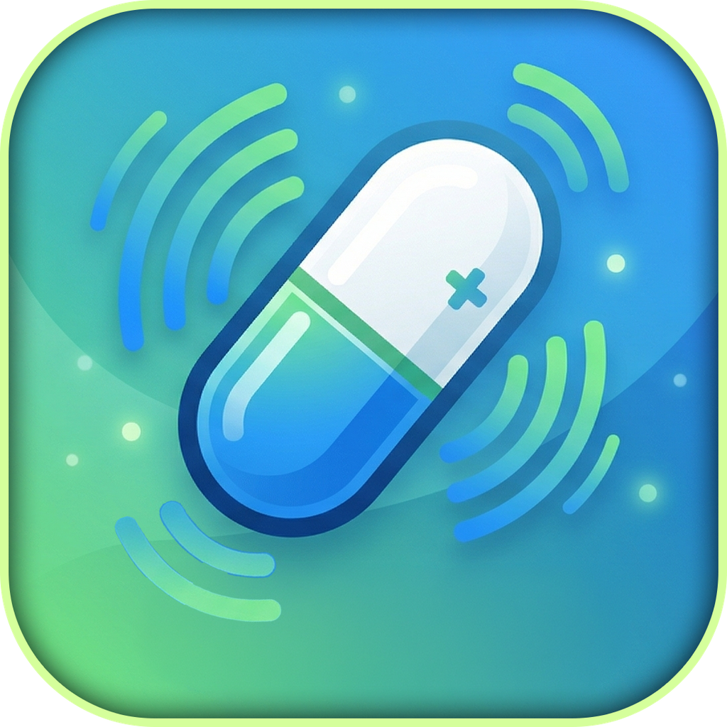
The app icon centres the product's language: clinical and calm, not alarming. It reads clearly at thumbnail size. In-product, every interactive element echoes the pill shape - buttons, chips, inputs. The mascot Pilpilon (a tilted pill capsule) appears on medication cards as a friendly visual anchor without trivialising the content.
Motion as signal, not decoration.
The cuts I'd defend.
A solo healthcare app has to be ruthless about scope and careful about trust. Here's what I left out on purpose - each cut protects patient privacy, reduces cognitive load, or removes a failure mode.
All data stays on-device, always. Medication names, dose schedules, and adherence history are sensitive health information. Syncing to the cloud requires a backend, a privacy policy, and a data model - and introduces a single point of failure. Local-only storage eliminates those risks entirely. The trade-off is no cross-device sync, which is a fair price for a personal health tool.
No sign-up, no login, no email required. The moment a healthcare app asks for an account, trust drops and friction rises. Zero onboarding friction matters when the app will be handed to a patient at the end of a clinical visit and needs to be running within minutes.
No SDK, no events, no telemetry. An analytics SDK would track what patients do inside a medication app - that is medical-adjacent data. It stays out. Gaps in my understanding of usage are a fair trade for not instrumenting health-related behaviour.
No leaderboards, streaks, or sharing. Gamifying medication adherence can create the wrong incentive - a patient who feels they have "failed" their streak may disengage. Positive reinforcement is built in (progress bar, step completion) but privately, without social comparison or penalty mechanics.
Built solo, shipped to the App Store.
One React Native codebase runs on iOS. Supabase handles the one case where a server is genuinely needed - plan sharing via short link. Everything else lives on-device. No excessive dependencies; just the tools that do the job.